2021年4月12日 星期一

2021-R軟體與Shiny Web應用程式設計


課程目標:

以R語言做為Web服務平台,使學員熟悉使用shiny套件建立Web化服務應用。

Shiny套件的主要功能 (revised from: Hadley Wickham, 2021)

1. 建立企業級儀表板

2. 互動式篩選資料分析

3. 使用視覺化與互動式溝通

4. 建立自我資料分析的工作流程

5. 建立互動式統計教學與資料科學概念,調校參數,理解結果之改變.

6. 提供決策者探索式資料分析等企業智慧計算應用.


課程大綱:

1.基礎shiny程式設計

1.1 shiny套件簡介

1.2 建立第一個shiny網頁程式

1.3 資料物件處理(tidyr, dplyr, stringr套件)

1.4 輸入控制項與檔案上傳

1.5 輸出控制項(文字,表報,圖形ggplot2, leaflet)

1.6 案例示範與操作練習(一)

2.進階shiny程式設計

2.1 版面配置

2.2 HTML UI

2.3 反應型函數(Reactive function)

2.4 shape檔案的輸入與處理

2.5 地理資料-shiny進階網頁程式

2.6 案例示範與操作練習(二)

上課日期:

2021年5月8,9日

報名網頁:

https://www.iiiedu.org.tw/courses/msa331t2101/

2021/5/3前報名即可享優惠價!

#shiny

#visualization

#training

#ggplot2

#leaflet

2021年3月17日 星期三

R-4.0.4-Patched 終結中文亂碼

更新

2021.4.1 

更新至最新版本至R-4.0.5, Windows and Mac 使用時皆不會有中文亂碼.

問題

近日 Windows 系統更新至最新版本 R-4.0.4, 使用時會有中文亂碼問題???


方法

下載最新更新檔即可解決此問題.

檔名: R-4.0.4patched-win.exe

參考: https://cran.r-project.org/bin/windows/base/rpatched.html

下載: https://cran.r-project.org/bin/windows/base/R-4.0.4patched-win.exe


關鍵字

#R

#debug

2021年3月15日 星期一

R shiny 互動模型 crosstalk 套件


主題

R在使用 shiny 套件建立網頁應用程式時, 如果希望二個控制項 (widgets)產生互相聯動效果, 此時可考慮使用 crosstalk 套件[1]. 例如:圖形上選取一個或一個以上之範圍,旁邊自動篩選資料值. 詳細使用方法參考crosstalk官網[2]之說明. 此互動式功能與 plotOutput("plot1", click = "plot_click")[3]功能類似. 本範例說110年2月年粗出生率(%)之互動式繪圖, 資料來源[4].

使用觀念

  1. crosstalk 套件使用 R 的API稱為「SharedData R6 class」。
  2. 將SharedData物件傳遞給資料框或其他R物件,即可產生互動連結之效果。
  3. 支援使用 htmlwidget 套件客製化互動控制項。

關鍵字
#shiny
#crosstalk
#interactive plot
#leaflet

套件
library(readxl)    # read_excel 匯入 Excel 資料檔
library(crosstalk) # SharedData 互相聯動效果
library(leaflet)   # leaflet    互動式地圖
library(DT)        # datatable  互動式表格
library(htmltools) # tags       HTML標籤

執行結果


R程式碼下載


R程式碼


# date     : 2021.03.16
# author   : Ming-Chang Lee
# email    : alan9956@gmail.com
# RWEPA    : http://rwepa.blogspot.tw/
# Encoding : UTF-8

library(readxl)    # read_excel
library(crosstalk) # SharedData
library(leaflet)   # leaflet
library(DT)        # datatable
library(htmltools) # tags

# 匯入資料
# https://github.com/rwepa/DataDemo/blob/master/taiwan_birth.xlsx
birth <- read_excel("taiwan_birth.xlsx")

# 將資料轉換為 SharedData 物件
df <- SharedData$new(birth[c("city", "annua_crude_birth_rate", "longitude", "latitude")])

# 建立標題標題
rr <- tags$div(
  HTML('<a href="http://rwepa.blogspot.com/">110年2月粗出生率%</a>')
)

# 建立2行互相聯動效果
bscols(widths = c(5, 7),
  leaflet(df, height=700) %>% 
    addTiles() %>% 
    addMarkers(popup = ~city) %>% 
    setView(lng = 120.9876, lat = 23.8387, zoom = 7) %>%
    addControl(rr, position = "topright"),
  datatable(df,
            rownames = FALSE,
            colnames = c("地區","110年2月台灣粗出生率%", "經度", "緯度"),
            options = list(pageLength = 10,
                           searching = FALSE),
            height=600)
)
# end

2021年3月2日 星期二

Python統計分析與最佳化計算課程

課程介紹:

課程採用免費Python軟體為主,主題包括基礎的資料結合、資料摘要與繪圖技巧、統計檢定、邏輯斯迴歸、高維度影像資料計算、線性與非線性最佳化應用。課程將透過案例示範與實際操作練習以增進學習成效。

課程目標:

使學員熟悉Python語言進行統計分析與最佳化計算,課程包括Python與資料庫連結、資料摘要與繪圖技巧、統計分析、線性與非線性模型最佳化計算。

報名: https://www.beclass.com/rid=2443e965faa62b76ba01


2021年1月21日 星期四

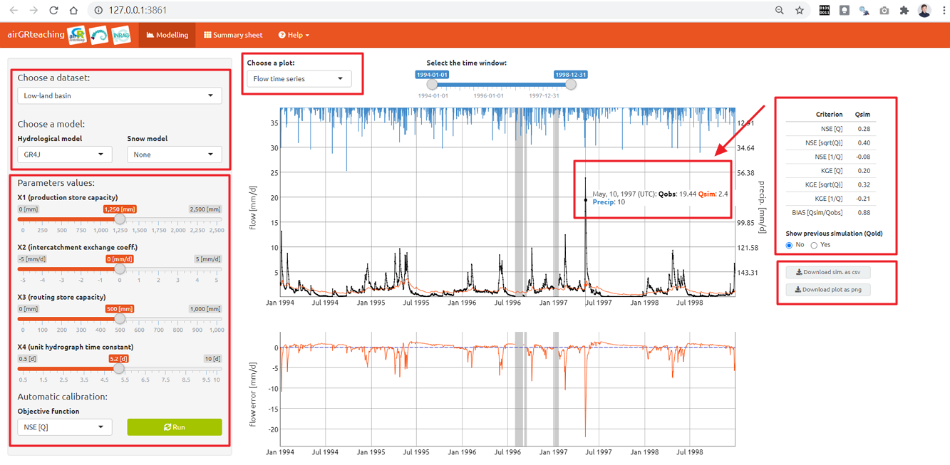
水文建模shiny應用 (Hydrological Modelling with shiny app)

主題

R在水文模型具有廣泛應用,包括水文資料的讀取與下載,水文資料分析與建模,詳細可參考 CRAN-Hydrology  [https://cran.r-project.org/web/views/Hydrology.html]。 其中 AirGR套件提供水文建模工具,該套件包括降雨徑流模型,積雪和融雪模型以及相關的校準和評估功能。另 airGRteaching套件,將建模結果以互動式網頁呈現,提供使用者更進一步的水文分析與應用。如果需修改為職場的內容,可修改 "C:\Users\88697\Documents\R\win-library\4.0\airGRteaching\ShinyGR"資料夾的 ui.R,server.R 二個檔案。

執行結果1: 水文模型


執行結果2: 水文模型綱要圖


關鍵字

# Hydrological Modelling 
# shiny

套件

1. airGR 套件 - 建立水文建模 https://cran.r-project.org/web/packages/airGR/index.html
2. airGRteaching 套件- 提供水文建模互動式網頁呈現 https://cran.r-project.org/web/packages/airGRteaching/index.html
3. shiny套件 - 提供互動式網頁功能 https://cran.r-project.org/web/packages/shiny/index.html

R程式碼下載


R程式碼

# title   : 水文建模shiny應用
# author  : Ming-Chang Lee
# email   : alan9956@gmail.com
# RWEPA   : http://rwepa.blogspot.tw/
# GitHub  : https://github.com/rwepa
# resource: https://rwepa.blogspot.com/2021/01/shiny-hydrological-modelling-with-shiny.html

# 安裝2個基本套件
# install.packages(c("airGR", "airGRteaching"))

# 使用remotes套件, 安裝最新版htmlwidgets套件
# 一定要安裝最新版htmlwidgets套件, 否則會有錯誤.
# install.packages("remotes")
# remotes::install_github("ramnathv/htmlwidgets")

library(airGRteaching)

# 載入L0123001資料集
data(L0123001, package = "airGR")

# 顯示物件清單
ls()
# [1] "BasinInfo" "BasinObs"

head(BasinObs)
# "DatesR": 年-月-日, POSIXct物件
# "P"  : average precipitation [mm/time step] 每日平均降雨量
# "T"  : catchment average air temperature [℃]  平均氣溫
# "E"  : catchment average potential evapotranspiration [mm/day] 平均潛在蒸發量
# "Qls": outlet discharge [l/s] 出水口排出量
# "Qmm": outlet discharge [mm/day] 出水口排出量

# 建立低地盆地資料
BV_L0123001 <- BasinObs[0001:6000, c("DatesR", "P", "E", "Qmm", "T")]

# 建立多山盆地資料
BV_L0123002 <- BasinObs[5000:9999, c("DatesR", "P", "E", "Qmm", "T")]
BI_L0123002 <- BasinInfo

# 建立互動式網頁資料分析
ShinyGR(ObsDF = list("Low-land basin" = BV_L0123001, "Mountainous basin" = BV_L0123002),
        ZInputs = list(NULL, median(BI_L0123002$HypsoData)),
        HypsoData = list(NULL, BI_L0123002$HypsoData),
        NLayers = list(5, 5),
        SimPer = list(c("1994-01-01", "1998-12-31"), c("2004-01-01", "2006-12-31")),
        theme = "United")

# theme 預設值為 "RStudio",可修改為以下值:
# ["Cerulean", "Cyborg", "Flatly", "Inrae", "Saclay", "United" or "Yeti"]

2020年9月26日 星期六

ggplot2-新增數學式-以迴歸分析模型為例 (regression line equation)

ggplot2-regression line equation


感謝Joey提供此問題, 本篇文章說明 ggplot2 繪圖新增數學式-以迴歸分析模型為例 (regression line equation)

主題

1. 使用 group_by 與 do 建立迴歸分析
2. 方法1:使用文字型態建立註釋(annotation)
3. 方法2:使用 expression 建立註釋(annotation),加上 parse = TRUE
4. 使用 annotate 新增迴歸分析數學式標示
5. 使用 ggtitle 建立標題
6. 使用 element_text(hjust = 0.5) 設定標題置中排列

關鍵字

# group_by
# do
# paste0
# round
# ifelse
# geom_point
# geom_smooth
# annotate
# ggtitle
# theme

套件

1. ggplot2 - 使用 ggplot2 套件繪圖
2. dplyr - 使用 %>% 與 group_by 進行資料處理

R程式碼下載


R程式碼


# title        : ggplot2-新增數學式-以迴歸分析模型為例
# author    : Ming-Chang Lee
# email     : alan9956@gmail.com
# RWEPA : http://rwepa.blogspot.tw/
# GitHub  : https://github.com/rwepa
# resource : https://rwepa.blogspot.com/2020/09/ggplot2-equation.html

library(ggplot2)
library(dplyr)

head(iris)

# 計算群組lm
fitted_models <- iris %>%
  group_by(Species) %>% 
  do(model = summary(lm(Petal.Length ~ Petal.Width, data = .)))

# levels:取出Species欄位的所有可能等級
names(fitted_models$model) <- levels(iris$Species)

# 檢視成果
fitted_models

# 查看群組lm結果(全部)
fitted_models$model

# 查看群組lm結果(setosa)
fitted_models$model$setosa

# 方法1:使用文字型態建立註釋(annotation)
mylabel <- c()
for (i in 1:length(fitted_models$model)) {
  mylabel <- c(mylabel, paste0(names(fitted_models$model[i]), ': Petal.Length = ',
                               round(fitted_models$model[[i]]$coefficients[1], 2), " ",
                               ifelse(fitted_models$model[[i]]$coefficients[2] >= 0, '+ ', ''),
                               round(fitted_models$model[[i]]$coefficients[2], 2), ' * Petal.Width,',
                               ' R2 = ', round(fitted_models$model[[i]]$r.squared, 2)))
}
mylabel
gg_color_hue <- function(n) {
  hues = seq(15, 375, length = n + 1) # seq(0, 360, ...)
  hcl(h = hues, l = 65, c = 100)[1:n]
}
# 繪製群組迴歸模型
p <- ggplot(iris, aes(Petal.Width, Petal.Length, group=Species)) +
  geom_point(aes(color=Species), size=2) +
  geom_smooth(aes(color=Species), method=lm, se=FALSE) +
  annotate('text', label = mylabel, x = 0.7, y = c(2.5, 2, 1.5), size = 4, hjust = 0, color = gg_color_hue(n = 3)) +
  ggtitle("iris群組線性模型統計圖") +
  theme(plot.title = element_text(hjust = 0.5)) # 設定標題置中排列
p

# 方法2:使用expression建立註釋(annotation),加上 parse = TRUE
mylabel <- c()
for (i in 1:length(fitted_models$model)) {
  mylabel <- c(mylabel, paste0(names(fitted_models$model[i]), ': ', 'Petal.Length == ',
                               round(fitted_models$model[[i]]$coefficients[1], 2), " ",
                               ifelse(fitted_models$model[[i]]$coefficients[2] >= 0, '+ ', ''),
                               round(fitted_models$model[[i]]$coefficients[2], 2), ' * Petal.Width ', '~', 
                               'R^{2} == ', round(fitted_models$model[[i]]$r.squared, 2)))
}
mylabel
p <- ggplot(iris, aes(Petal.Width, Petal.Length, group=Species)) +
  geom_point(aes(color=Species), size=2) +
  geom_smooth(aes(color=Species), method=lm, se=FALSE) +
  annotate('text', label = mylabel, x = 0.7, y = c(2.5, 2, 1.5), size = 4, hjust = 0, color = gg_color_hue(n = 3), parse = TRUE) +
  ggtitle("iris群組線性模型統計圖-使用 parse參數") +
  theme(plot.title = element_text(hjust = 0.5))
p
# end

2020年9月20日 星期日

ggplot2 套件 - hcl 客製化繪圖顏色 (customized color)


# ggplot2
# scale
# hcl
# ggtitle
# theme

本篇文章說明 ggplot2 繪圖的顏色主題,內容包括:
1. 使用標準單一顏色.
2. 使用ggplot2內建群組顏色.
3. 使用scales套件,檢視繪圖資訊.
4. 使用客製化 hcl {grDevices}

套件:
1. ggplot2 - 使用ggplot2套件繪圖
2. scales - 擷取ggplot2套件的繪圖資訊
3. gridExtra - 進行多列多行 ggplot2 繪圖


R程式碼下載:

R程式碼:
library(ggplot2)

# 方法1 使用標準單一顏色
ggplot(iris, aes(Petal.Width, Petal.Length)) +
  geom_point(size=2) +
  ggtitle("圖1 ggplot2-使用標準單一顏色") +
  theme(plot.title = element_text(hjust = 0.5))

圖1 ggplot2-使用標準單一顏色


# 方法2 使用ggplot2內建群組顏色
ggplot(iris, aes(Petal.Width, Petal.Length, color=Species)) +
  geom_point(size=2) +
  ggtitle("圖2 ggplot2-使用內建群組顏色") +
  theme(plot.title = element_text(hjust = 0.5))

圖2 ggplot2-使用內建群組顏色


# 方法3 使用scales套件,檢視繪圖資訊.
library(scales)

p <- ggplot(iris, aes(Petal.Width, Petal.Length, group=Species)) +
  geom_point(aes(color=Species), size=2)

# ggplot2使用的繪圖顏色
# ggplot_build {scale} 可擷取ggplot2繪圖的相關資訊等
col <- unique(ggplot_build(p)$data[[1]]$colour)

# 顯示ggplot2使用的繪圖顏色
show_col(col) # "#F8766D" "#00BA38" "#619CFF" (紅綠藍)

# 將所有顏色轉換成 factor, 加上 levels 參數, 以免顏色異常.
mycol <- factor(ggplot_build(p)$data[[1]]$colour, 
                levels = c("#F8766D", "#00BA38", "#619CFF"))

# 使用 gridExtra 套件進行多列,多行繪圖, 類似 par(mfrow=c(1,2))功能
library(gridExtra)

p1 <- ggplot(iris, aes(Petal.Width, Petal.Length)) +
  geom_point(aes(color=Species), size=2) +
  ggtitle("圖3 ggplot2-使用預設顏色") +
  theme(plot.title = element_text(hjust = 0.5))

p2 <- ggplot(iris, aes(Petal.Width, Petal.Length)) +
  geom_point(aes(color=mycol), size=2) +
  ggtitle("圖4 ggplot2-使用scales套件(二者相同") +
  theme(plot.title = element_text(hjust = 0.5))

# 設定1列, 2行繪圖
# 右側圖例有改善空間!
grid.arrange(p1, p2, nrow=1, ncol=2)

圖3, 圖4 ggplot2-使用scales套件(二者相同


# 方法4 使用客製化 hcl {grDevices}

# ggplot2 內部使用 HCL 顏色規範,參考孟塞爾顏色系統 (Munsell Color System)


# 色相(hue)指的是色彩的外相,表示在不同波長的光照射下,人眼所感覺不同的顏色.
# 在HSL和HSV色彩空間中, H指的就是色相,以紅色為0度(360度);黃色為60度;綠色為120度;青色為180度;藍色為240度;品紅色為300度.

# hcl(h = 0, c = 35, l = 85, alpha, fixup = TRUE)

# h(hue 色相): The hue of the color specified as an angle in the range [0,360].
# 0 yields red, 120 yields green 240 yields blue, etc.

# c(chroma 色度): The chroma of the color. The upper bound for chroma depends on hue and luminance.

# l(value 明度): A value in the range [0,100] giving the luminance of the colour. For a given combination of hue and chroma, only a subset of this range is possible.

# hue 色相    : 0~360度表示
# chroma 色度 : 中間為0, 向外擴散增加
# value 明度  : 南北上下軸表示明度(value)的深淺, 從全黑(N0)至全灰(N5)到全白(N10)


gg_color_hue <- function(n) {
  hues = seq(15, 375, length = n + 1) # seq(0, 360, ...)
  hcl(h = hues, l = 65, c = 100)[1:n]
}

n <- 3

gg_color_hue(n) # "#F8766D" "#00BA38" "#619CFF"

cols <- factor(rep(gg_color_hue(n), each = 50),
               levels = c("#F8766D", "#00BA38", "#619CFF"),
               labels = c("setosa", "versicolor", "virginica"))

ggplot(iris, aes(Petal.Width, Petal.Length, color=cols)) +
  geom_point(size=2) +
  ggtitle("圖5 ggplot2-使用客製化hcl函數") +
  theme(plot.title = element_text(hjust = 0.5)) +
  scale_colour_discrete("Species") +
  theme(legend.title.align=0.5)


# end